Design-System-Tokenisation
Why Fusion?
FUSION, where design elements come together like atoms in nuclear fusion, forming cohesive and powerful digital experiences. Just as atoms fuse to create new elements, FUSION brings together the building blocks of Ul design to help you craft seamless and innovative user interfaces.
Explore the elements of FUSION
Design Language: The Core Elements
Discover the foundational elements of our design language, where colors, typography, and iconography converge to form the nucleus of your designs.
Guidelines : Crafting Cohesive Experiences
Leam the best practices and guidelines for crafting cohesive and accessible user interfaces with FUSION. From layout principles to accessibility standards, we've got you covered.
Components: The Atoms and Molecules of Ul Design
Explore our extensive catalog of Ul components—where atoms and molecules come together to form complex and beautiful interfaces. From buttons and forms to navigation bars and cards, find everything you need to build sleek and intuitive user experiences.

What is design tokens?
Design tokens are name and value pairings that represent small, repeatable design decisions. A token can be a color, font style, unit of white space, or even a motion animation designed for a specific need.
For example, instead of choosing of many shades of green for an icon,we can apply a design token that isis consistent with all similar usages across our products: color.icon.success.
What are themes?
A theme is a collection of token values designed to achieve a certain look or style. Themes are how we switch color schemes and styles everywhere using a single set of tokens.
Light mode, dark mode, and high-contrast mode are all examples of theming
Why use design tokens?
Features like global theming (dark mode), responsive design, and user customization are possible with tokens.
Design tokens simplify the design and development by streamiining decision making and handoverbetween crafts.
Changes can be made once across the system and products. No more finding and replacing hard-coded values everywhere. This will deliver visual consistency and other improvements to UI.
How to read design token names
knowing how to read token names help you find the right token faster when working in designs and code

A design token's name describes how it should be used, and each part communicates one piece of its usage.
1. Foundation: The type of visual design attribute or foundational style, such as color, elevation, or space.
2. Property: The Ul element the token is being applied to, such as a border, background, shadow, or other property.
3. Modifier: Additional details about the token's purpose, such as its color role, emphasis, or interaction state. Not every token has a modifier. For example, color.text.default is our default body text color.
Categories of design tokens
Design tokens are typically categorized into different levels of abstraction to allow for fiexibility and scalability:
1. Primitive Tokens: These are the most basic tokens, representing fundamental design values like colors, typography styles, spacing, etc. Primitive tokens define the core elements of your design system, such as a primary color or a base font size. These tokens act as the foundational building blocks.
2. Alias Tokens: Alias tokens reference primitive tokens and often group them by function or context. For example, you might have a set of alias tokens for a "light" theme that references specific primitive tokens for color and typography. These tokens allow you to create abstractions that represent more complex design concepts, such as button backgrounds or text colors for various themes.
3. Mapped Tokens: Mapped tokens are typically used for specific applications or contexts, connecting alias tokens to specific use cases. For instance, you might map alias tokens to components or elements within your design system, such as defining how a primary button should appear in different themes.
Connecting the tokens
The key to a robust design system is the interconnection between these token levels. Here's a simplified explanation of how the connection works:
Primitive Tokens as Base Values: Primitive tokens define your core design elements. For example, you might have a token for the primary color and another for the secondary color.
Alias Tokens to Organize Context: Alias tokens connect to primitive tokens, providing a layer ofabstraction. If you have different themes (like light and dark modes), alias tokens let you organize and switch between them easily.
Mapped Tokens for Specific Use Cases: Mapped tokens build on alias tokens to define specific components or situations. This level connects the abstracted alias tokens to concrete design elements, like buttons, backgrounds, and typography in your application's user interface.
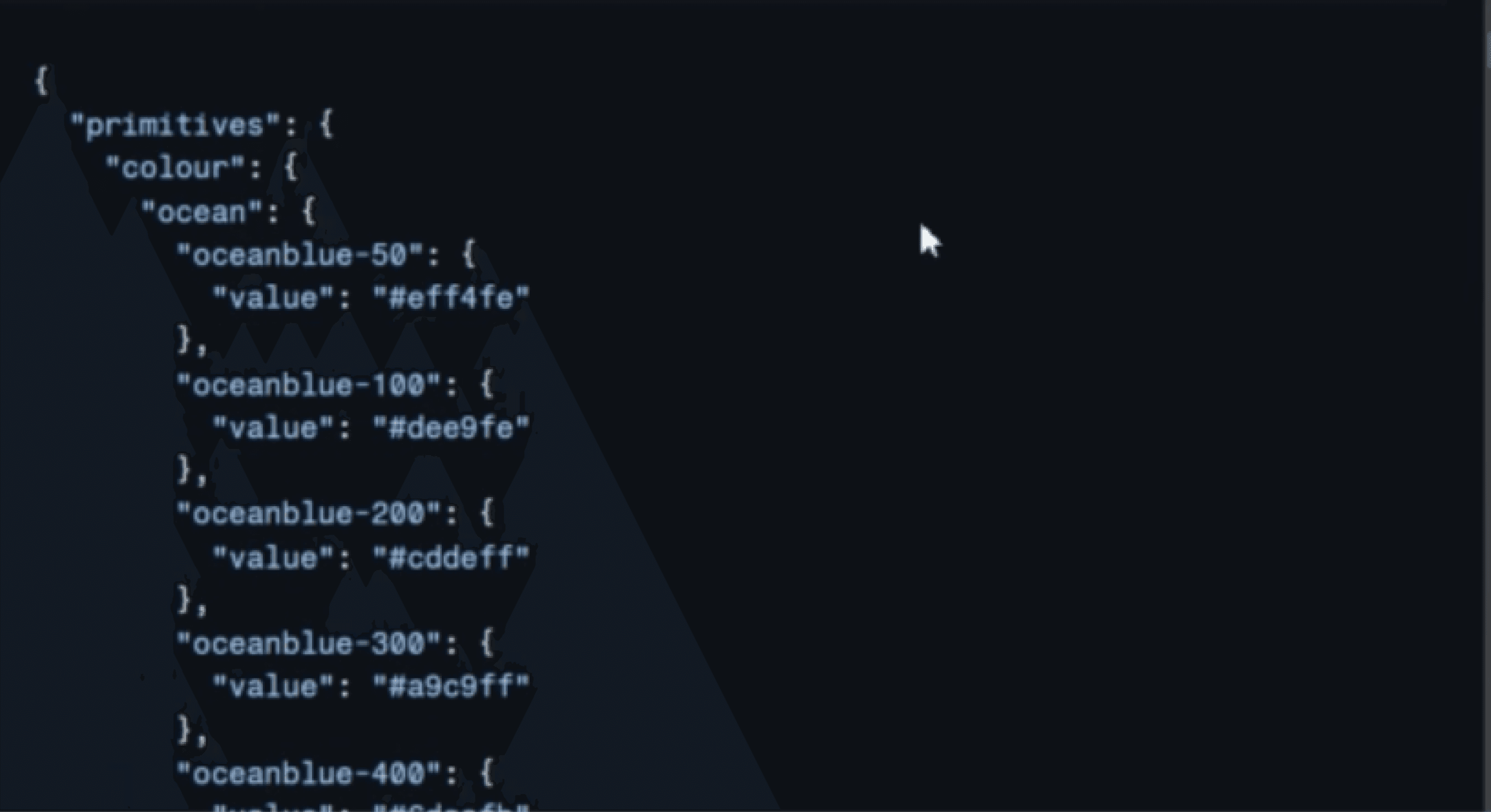
JSON file
All list of tokens
Surface
Text
Border
Icon

Color System
A color system is a critical component of a robust design system, providing a consistent and scalable approach to color management. By establishing a clear color palette, you create a harmonious and easily adaptable design framework for various contexts, such as branding, user interface elements, and theme- based applications.
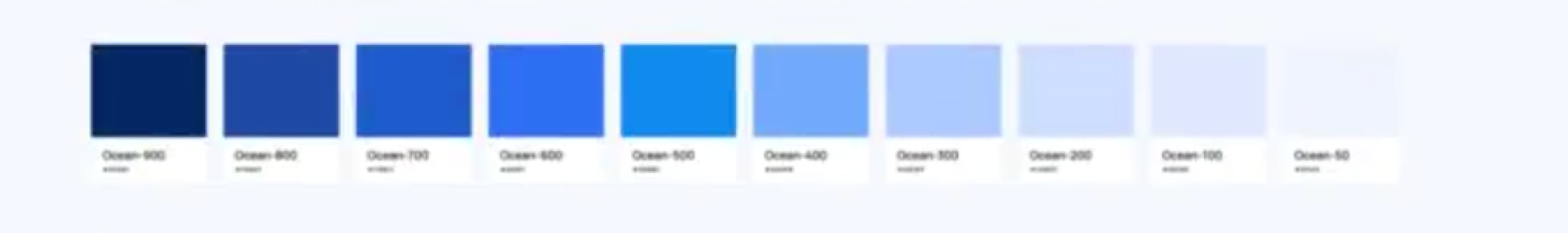
The core of fusion ocean blue
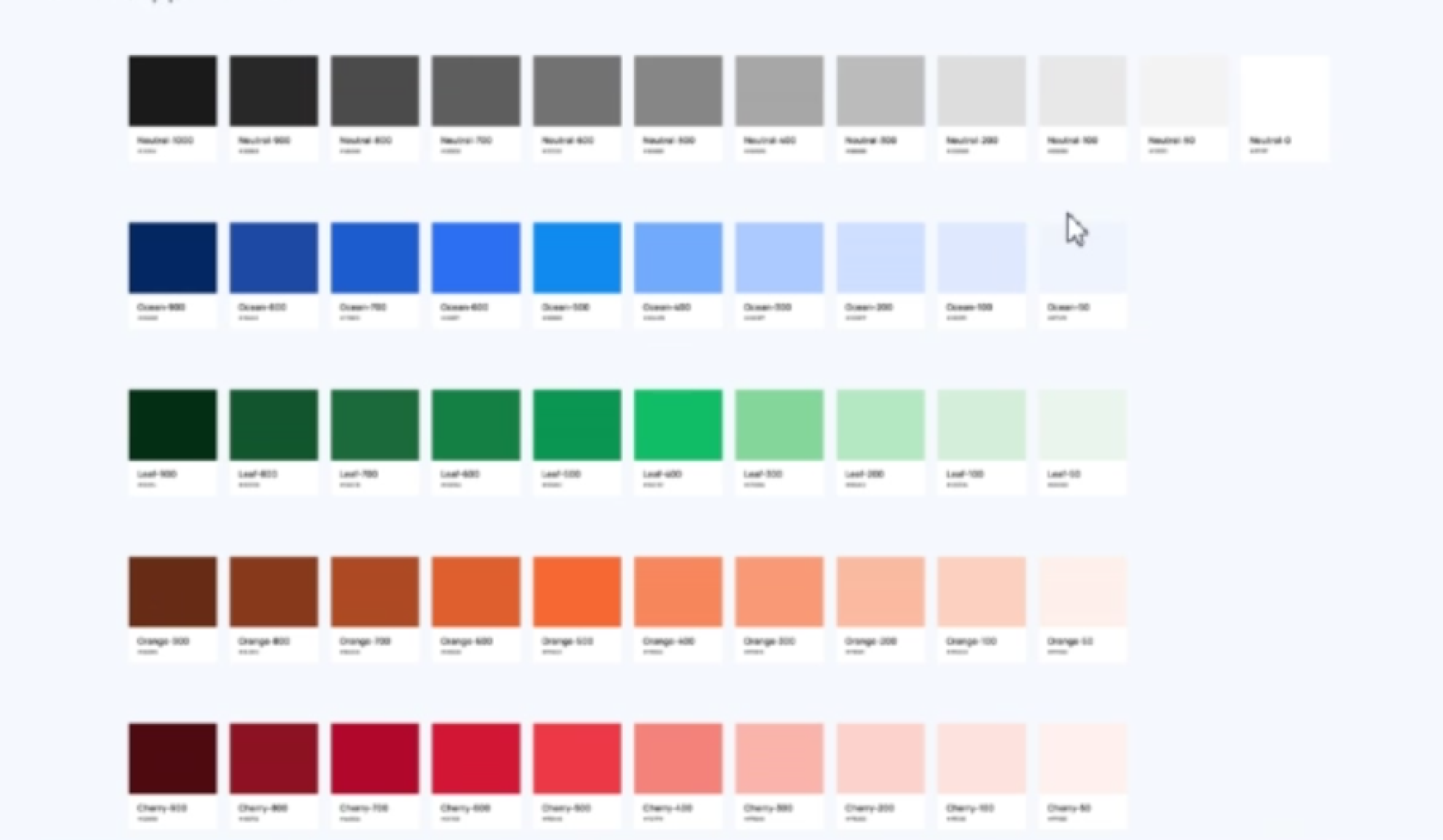
At the heart of Fusion is our primary color, Ocean Blue. This isn't just any blue—it's a versatile spectrum that ranges from light to dark. You can think of it as 50 all the way up to 900, where the lighter shades are at the lower end, and the darker shades are at the upper end.
Light Shades (50-200): These shades are great for creating a soft, airy feel. They're perfect for backgrounds, light accents, and any design elements where you want to keep things subtle and spacious.
Mid-Tone Shades (300-600): This is where the magic happens for interactive elements. Buttons, links, and active states—all benefit from these vibrant yet balanced blues.
Dark Shades (700-900): Need contrast? This is your go-to range for text, borders, and anything thatnvaan‘vssasvmgwsflh\paci.n'sasomask:kxammgas«mdasmhh%akvmmifim
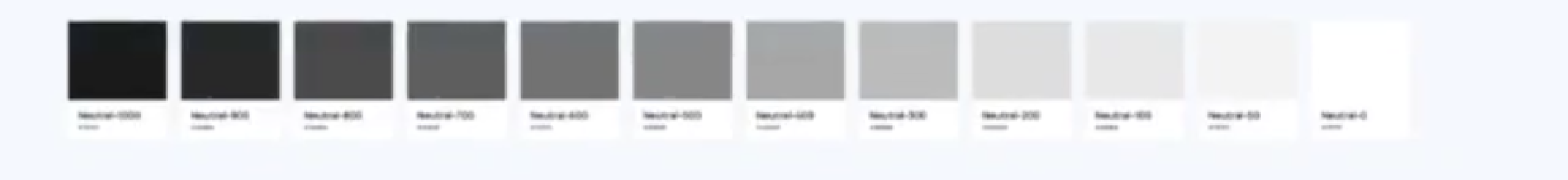
Balance Neutrals
Neutrals are the unsung heroes of any color system, and in Fusion, we embrace a broad range from white (0) to black (1000). Here's how we use them:
Light Neutrals (0-200): These are the shades that keep things bright and open. Ideal for backgrounds and subtie dividers, they give you a clean canvas to work with.
Mid-Tone Neutrals (300-700): This range is super versatile. It's perfect for text, Ul components, and anything that needs a balanced touch of gray without being too stark. [
Dark Neutrals (800-1000): These shades add sophistication and depth. Use them for text, icons, and other elements where high contrast is essential. They're also perfect for creating sleek dark themes.
Semantic Colors
Fusion isn't just about looking good—it's about conveying meaning. That's where our semantic colors come in. These colors tell a story, guide users, and add an extra layer of communication to our design system.
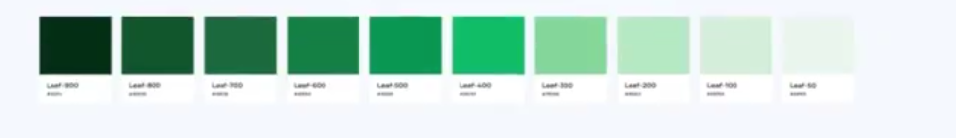
Leaf (Green): Green is all about positivity and success. If you see Leaf in Fusion, it's likely indicatingsomething good—iike a successful action or a positive message. N
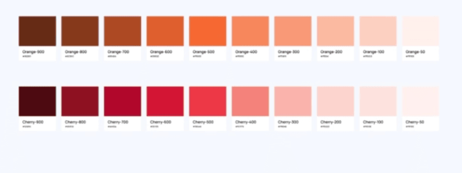
Orange (Yellow): Orange is our cautionary color. It's a heads-up, a waming. It's not as intense as red, but itlets you know to be alert and pay attention.
Cherry (Red): When you see Cherry, you know it's serious. This is our color for errors, critical messages,