Supervision : LM - TPI Integration
Company
Solera Inc
Duration
5 Months
Main Collabarators
Joe Sullivan (UX/UI manager)
Josh Lax ( Senior Product owner)
Ruchi Gupta( Senior developer)
My Role
Product designer, Responsible for overall rebranding and integration of the 2 products LM and TPI and improve the UX which falls under our scope and redesign icons and create a working prototype.
🤯 The problem
The Current UI of License monitoring and TPI does not align with Solera’s design language post - acquisition. There’s a need to update interface to match Solera branding and enhance user experience . This mismatch affects brand consistency and user satisfaction, necessitating a redesign to align LM and TPI with Solera’s visual identity and standards.

🔍 Research
Primary users of the system are going to be fleet managers.
Secondary users are goint to be truck drivers
So we started this project with a little bit of research
What does success look like? (for our customers, the business, etc…)
What is the problem we want to solve?
Who is this for?
What is the scope of this project?
Goals
Based on the research, we captured these goals for all stakeholders, which became a direction for the project.
Users { Truck Drivers }
Without slowing down the process much, we wanted to bridge the connection between LM and TPI and provide a consistent experience for our users. Updating the design system and maintaining a proper visual heirarchy.
Developers (Contentstack Engineers)
We wanted to reduce the development effort by identifying common components. Also, changing at one place should reflect throughout the app.
🎨 Kicking of the design
I started of with interviewing the stakeholders to understand the project better and to see which components and features are used the most
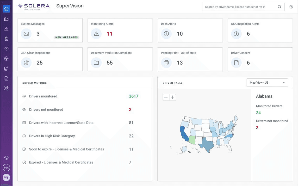
Dashboard
Current LM Dashboard

Current TPI Dashboard

Upgrading the dashboard
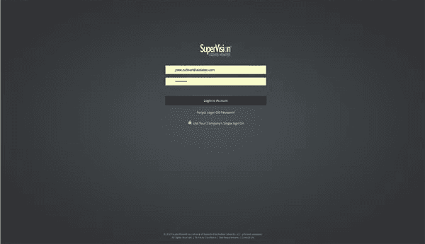
Login
The login screen is simple and functional, but it feels dated and visually flat. It serves the purpose but doesn’t convey trust, brand personality, or a polished user experience

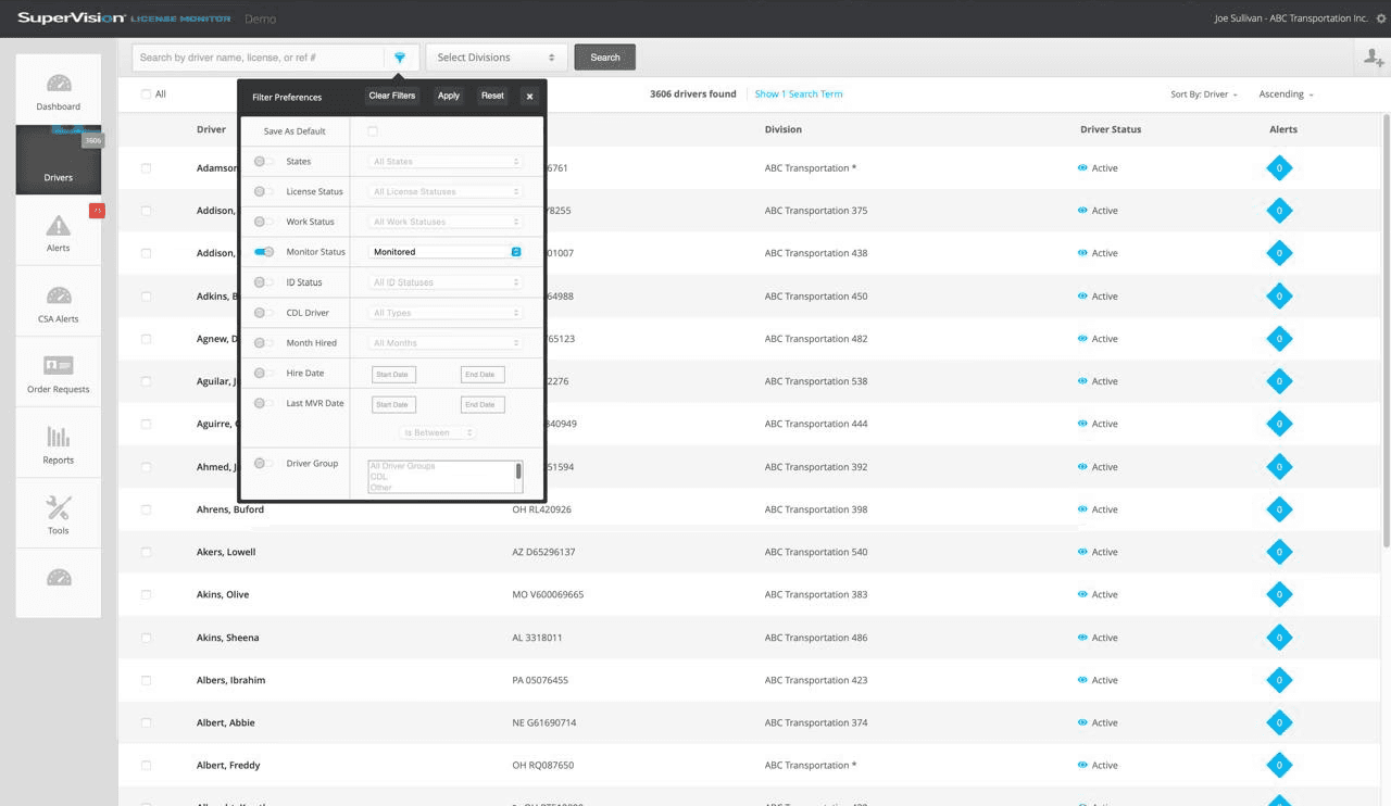
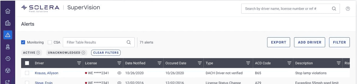
Filtering
The filter menu appears functional and data-heavy, but its visual hierarchy and usability can be improved. It currently looks cluttered and lacks clarity for quick scanning or decision-making.
The user needs to toggle between different filters to turn on the filter
There is now real time data visualisation on applying the filters
New Filtering

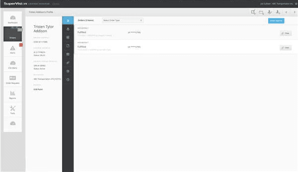
Driver Profile
The filter menu appears functional and data-heavy, but its visual hierarchy and usability can be improved. It currently looks cluttered and lacks clarity for quick scanning or decision-making.
Old
New

Changing the oldschool icons

Current Icons look very much outdated and clumsy and there is no proper color contrast between the icons.

Prototyping
